

I totally get it. It’s rare for someone to excel in both crafting memorable stories and graphic design. Also, the person who wrote the book is just too close to the story to objectively assess whether or not a particular cover idea will help sell their book. Authors can also run into this problem when working with a professional designer who does whatever the author asks without considering the marketability of the cover.
Saying all this, I must admit that I’ve made all of my book covers so far.
I absolutely love watching people create the art for a cover. There are videos which demonstrate the technical aspects of making artwork, describe the fundamentals of design, show a speed through of the entire creation process, and teach how to mark the bleed, trim, and safety areas for a print cover. However, all of them focus on the final product, and I find the iterations of different ideas and mock-ups fascinating.
So, to give you an idea of how I came to the final cover for At Fault, I’ll share some of the other ideas I kicked around. I did a similar post with The End of Refuge, which you can find here.
A QUICK SKETCH
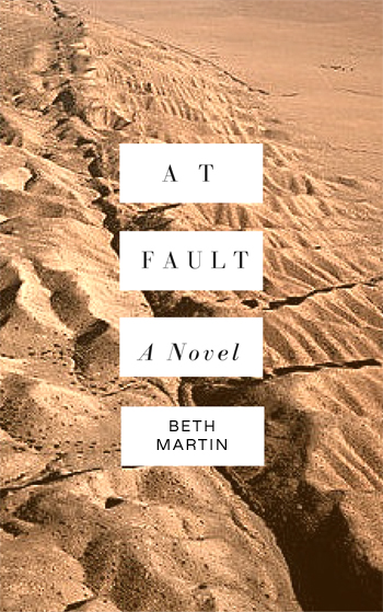
While drafting the novel, I came up with a quick and dirty cover to go with the title I had settled on. Since “fault” can mean a couple different things (and I like the title since both meanings fit), the cover needed to clarify that this story was primarily about fault lines.
I started with this cover template from Canva, dropped in a photo of the San Andreas Fault Line along with my name and title, and voilá, instant cover. It’s not very exciting or eye-catching and would be better suited to contemporary literature. But it’s a cover. Clearly, I needed to do better than that.
TIME FOR SOME STYLE
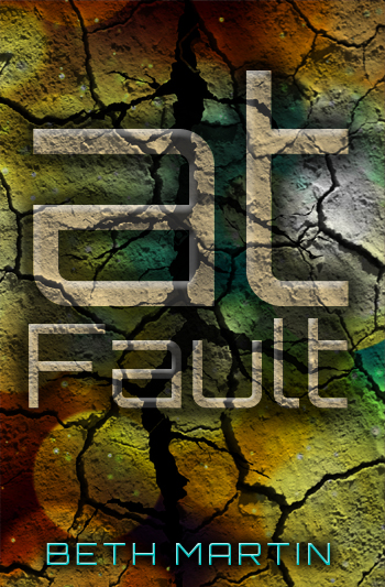
Since I couldn’t find any stock photos of an existing fault line that I liked, I decided to experiment with a typography-heavy cover. I tried a few different fonts, textures, color schemes, etc. but none of them were really impressive. The cracked earth texture and larger crack down the middle were cool details I’d revisit, but the overall effect was too vague.
DO YOU GET IT? EH?
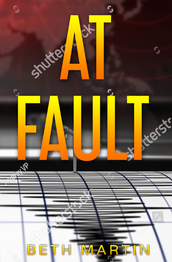
Although fault lines were an obvious direction for the cover, something that alluded to earthquakes would also be appropriate. But how do you convey ‘earthquake’ in an image? A Google search came up with plenty of photos of the aftermath of major earthquakes. However, destroyed buildings and roadways along with sad-looking people could be from a variety of natural disasters. More importantly, the novel is about scientific research and geology, not human suffering.
But there is one thing that says research and earthquakes! Do you know what it is? Do you recognize the picture above?
It’s a seismograph! The only reason I know what one looks like is from watching Bill Nye the Science Guy when I was a kid. I don’t believe this style is used any longer since it’s much easier to record seismic readings to a computer. It’s not a particularly iconic image that a lot of people will recognize, so this was a pass.
However, I had finally settled on fonts and their placement, so it wasn’t a total miss.
PUMP THAT OIL
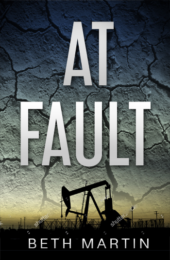
Was there anything else that related at all to fault lines? Going even further afield, I tried an image of an oil rig. Actually, a number of people suggested using one for the cover. When I looked up stock photos, all the images were of rigs and pumps in front of beautiful skies or sunsets. Since the novel doesn’t portray drilling for oil in a particularly positive light, it would be entirely misleading to have a glorious pump silhouetted against streaming rays of sun.
I tried sticking a rig on there anyway and adjusted the colors and added textures, but in the end, it missed the tone of the novel. I did like the aesthetic of a black silhouette over the sky and just needed to try a different approach.
ALMOST THERE
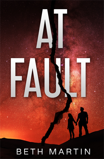
After ditching the seismograph and oil rig, I came back to putting a crack through the middle of the cover. There was still space between the title and my name that needed an interesting focal point. Something that all the previous iterations were lacking was a human element. I decided on a couple in a non-romantic pose on a desert landscape. The image I settled on has the Milky Way in the background which adds a nice bit of texture without being distracting. The original colors were pretty meh, so I added the red filter.
I sent this version to a few critique groups to get some feedback. The only change I made upon their suggestion was to offset the title on each side of the crack, which leads to the final cover.

I’m really happy with how the cover for At Fault turned out. It looks particularly stunning in print, so if you haven’t read it yet, consider getting a signed copy here.
No comments:
Post a Comment