

Ever since I was getting my first book ready to publish, I’ve had a fascination with book design. There are a lot of elements in book design that are there to ease the reading experience, make the text easy to follow, and let the rest of the page disappear. But one of my favorite elements not only looks pretty but also better draws you into the story. And that lovely design element is the delightful drop cap.
What are Drop Caps?
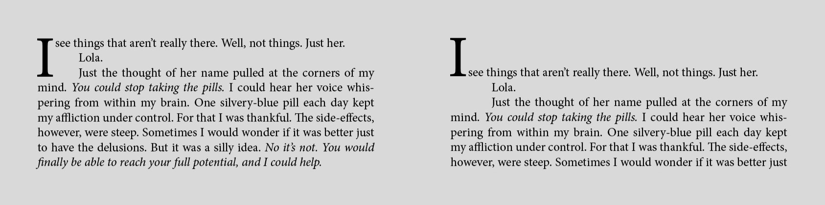
Even if you’re not familiar with the term, you’ve probably noticed drop caps before—they’re the large initial letter in a story with the next few lines of text wrapped around them. Whenever I see a large initial letter, it makes me want to immediately start reading—which is something that good book design strives to do. In practice, drop caps are usually two to three lines of text tall, but they can be much taller in some instances for a more dramatic effect.
Drop caps have been around for centuries, even gracing medieval manuscript pages with ornate filigree and colorful images. Once typesetting became commonplace, an area would be left blank so a scribe or artist could fill in the initial letter later, or decorative letters would be carved on blocks of wood in order to stamp the drop cap onto the page.

While drop caps can be found in any type of book, they are especially common in genres that lend themselves to a touch of the traditional or fantastical, such as historical fiction, fantasy, and classical literature. Regardless of the genre, when I put together design samples for a formatting client, I always try to include at least one design that showcases a drop cap.
Drop Caps Today
Modern typesetting software makes adding drop caps easy. The initial letter can match the rest of the text or be in a more decorative font. The drop cap can also be in a different color or weight than the rest of the text to add interest.
There’s one special case with drop caps (in the English language) that book designers have different opinions on. The drop cap should always be a letter, but when a chapter/story/text begins with a quote, the first character will be the open quotation mark. One way to deal with this is to simply omit the beginning quotation mark, but I don’t like this option since it makes the sentence grammatically incorrect. The other option is to make both the quotation mark and the first letter of the quote in the drop cap style. This does make the quotation mark larger, but it’s in proportion to the initial letter, which looks nice. I always go with this option when formatting books. (There’s the secret third option of asking the author to rewrite the beginning of each chapter so none of them begin with dialogue, but I would never ask an author to change the text of their story for the sake of the design.)
Drop Caps in Ebooks
After professing my love of drop caps, I must also whole-heartedly admit they do have a major shortcoming, and that’s their appearance in ebooks.
Ebooks are made to be flexible. Readers can choose their fonts, the space between lines, the margins around the page, and even the color theme of the book they are reading. On top of that, ereaders come in different shapes and sizes and can be read in landscape or portrait mode. Additionally, ereader apps can work on smartphones that have tiny screens and PCs using 4K displays.
Because of this need for flexibility, ebooks are coded using HTML and CSS—languages that give webpages their inherent adjustability as well. CSS can handle making beautiful drop caps, but there’s a certain level of control needed over the text style in order for them to look right. In ebooks, some of that style is taken away from the book designer and given to the reader, so there’s no way for the book designer to ensure their drop caps look consistently nice in an ebook.
My workaround for this—since I’ve already admitted to adding drop caps to almost every book—is another initial letter style called the raised cap. While the top of a drop cap aligns with the top of the text block, the bottom of a raised cap aligns with the bottom of the first line of text. It has a similar effect as a drop cap and still looks intentional and nice regardless of the font and spacing chosen by the reader.
Some more observant readers may point out, “Hey, Beth, I’ve read ebooks with drop caps and they looked great!” There are a variety of ereaders available, but Kindle readers have the ability to recognize the styling for drop caps and force them to display a certain way to match the reader's settings.
I hope you’ve enjoyed this deep dive into drop caps and their role in typography. If you like content like this, let me know! There are so many topics in book design that I could babble about endlessly, and I would love to share some of that information with you. And if you’re a writer looking for someone to turn your finished manuscript into a beautiful book, check out my formatting services here.
No comments:
Post a Comment