
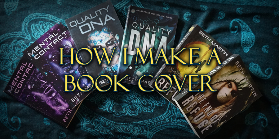
I was about to answer the question of ‘how I make my own book covers,’ which had been posed on a self-publishing forum for the millionth (slight hyperbole, but at least fifth or so) time, but I decided to flesh out the whole process in a blog post instead. I’ve glossed over the steps I take to make a cover several times on forums, but today, I'll go into detail of how I put them together. But in order to keep this post from becoming ridiculously long, I won’t be including print covers, just ebook.
Step 0: Should you make your own cover?
Probably not. It’s rare for someone to be excellent at writing and graphic design. And when those two skills combine, generally, it’s still not a great idea.
As the writer, you are too close to the story to be truly subjective. Authors commonly fall in the trap of trying to cram every element and theme onto the cover, falling in love with an image that just doesn’t work for a cover, or insisting that the artwork is an exact match to a specific character or scene in the book. It can be hard to pivot your perspective from your book as a piece of art to a product you are selling. The cover’s purpose is to sell the book to readers who will enjoy it. It needs to scream, “This book is for you!” and not, “This is a representation of everything inside.” Leave that second one for the description.
If you can step back from the story and put on your marketing hat, and also have some graphic design ability, you may be able to make a successful cover.
Step 1: Learn about covers
There are a ton of free resources online that go over what makes a good vs bad book cover. I highly recommend this article by Derek Murphey as a starting point.
Go to a bookstore and look at the section where your book would most likely belong and take a close look at the covers of books like yours. Which ones catch your eye? What colors are used? What style is the text? Which subjects appear on several covers? You’ll want your book to look like it’s supposed to be there.
Also, check out the categories on Amazon that your ebook would fall under. Take note of what styles are trending for your genre and the covers on other indie books which sell well.
Step 2: Mock up some ideas
You know what books in your genre look like, and you’re familiar with your story, so now it’s time to start brainstorming. Using either pencil and paper or a simple graphics program like Canva, sketch out some ideas for your cover. These are just quick mockups to give yourself an idea of what items you want and their general placement. Here’s a quick example of a mockup I’ve made using Canva.

This looks very different from the final product, but if you’re interested, you can check out the evolution of the cover for At Fault here.
Step 3: Shop for images and fonts
Once you have a handle on what you want your cover to look like, it’s time to start shopping. Keep in mind your photo-manipulation abilities (or lack thereof) while looking for the perfect image. I highly recommend purchasing stock photos instead of using free ones. They will be higher quality, more professional, and likely less prolific (the free stock photos available appear on A LOT of ebook covers—especially the cheaper premades). I generally stick to two images that won’t need much modification since I’m not great at image compositions or making drastic changes to an existing photo.
Before pulling the trigger on purchasing a picture, make sure to do a reverse image search to find places it’s been used. Some stock photos get around, and people may already associate the picture you want to use with another book or business (Don’t believe me? See how a single image gets around here, here, and here).
The next thing to look at is fonts. I steer clear of fonts that came with my computer since they’re too familiar (which can make a cover look amateur) and don’t come with a commercial license. There are tons of free fonts available (my favorite place to find them is 1001fonts) or you can purchase font-faces. Just be careful with free fonts—they may not be particularly well designed which will make your cover look unprofessional, and just because they’re free to download doesn’t mean they're free to use. Always read the license.
There are some really ornate and fancy fonts out there, so make sure the one you choose is legible. The title of your book should be immediately recognizable in a thumbnail.
Step 4: Put together the image
Now you can use your photos to start making your cover! I highly recommend using Adobe Photoshop for this. Things like Canva just aren’t powerful enough, and Gimp (an open source photo-manipulation software) is a nightmare to work with.
Ideal dimensions for cover files are 2,560 x 1,600 pixels. Amazon recommends 1:1.6 width-to-height ratio. I make the ebook and paperback covers concurrently, so the ebook one will have the same dimension as the paperback. Once you’ve created your image file, drop in your images and arrange them how you please.
Some general tips:
- When scaling an image, you can make it smaller than the original, but not larger. Blowing up a picture causes pixelation which will make the cover look blurry.
- Similarly, don’t ever stretch a photo. If the picture is made narrower or wider without also changing the height, it will look strange and people will notice that the cover doesn’t look right.
- Try to make some noticeable changes to the stock images. Unless you purchased an exclusive license (which would be very expensive), other people may purchase and use that same image. Although I check that the photos I choose aren’t already on other book covers, I want to ensure that my cover is still one of a kind. This can be done using interesting cropping, lighting effects, etc. My favorite tool is recoloring, which makes the colors more vibrant and eye-catching. Here’s an example of the changes I made on this stock photo of DNA which is featured on the cover of Quality DNA.
 |
| To the left is before editing and to the right is after adding some color and contrast |
Step 5: Add some snazzy text
Once the image looks good, it’s time to move on to adding the book title, author name, series title (if applicable), tagline, etc. Don’t go overboard with the text—a huge block of words will turn people off. The rule of thumb is no more than three fonts, but for book covers, it’s best to limit that even further to two. Generally, the more ornate or stylized text should be used for the title with a plainer font for the author name and other text.
 |
| I've used a number of text effects on these two titles. The images on the right show what they look like with the effects removed. |
Although you don’t want to use so many effects that it makes your cover unreadable, add something to make the title pop. Play with drop-shadows, bevels, textures, gradients, etc. until you find something that works.
Step 6: Use critiques
Once your cover is close to finished, ask for feedback. I like to post covers on Cover Critics which gives excellent critiques and suggestions. I’ve also used r/selfpublish and the Facebook group Indie Cover Project.
The hard part about getting feedback is that you need to use it. When several people agree that the cover isn’t working in a certain way, be ready to remedy that. Sometimes that means going back to the drawing board or even deciding to hire a designer instead, and there’s nothing wrong with doing that.
I hope you’ve found this post helpful! If so, let me know and I’ll do another post focusing on print covers and some of the nuances involved in designing for print.
No comments:
Post a Comment